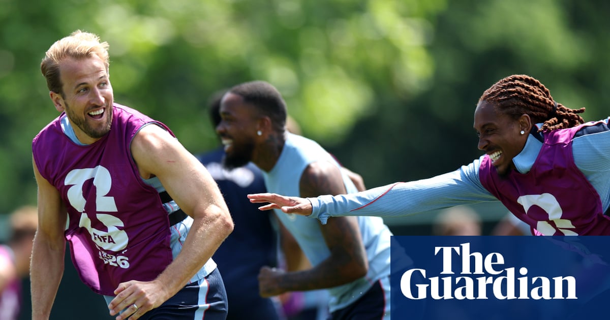
.png) 2 months ago
41
2 months ago
41
You would think primary shades would be the easiest colours to wear. Red, yellow, blue: we can name these before we can tie our shoelaces. They are not sophisticated colours, such as Armani greige or Pantone favourite Mocha Mousse. They are not challenging-to-wear colours, like chartreuse or mustard. They are Mr Men colours. So wearing them must be child’s play, surely.
And yet they are weirdly tricky to wear. They can feel shouty and basic: the getting dressed equivalent of speaking loudly without saying anything particularly interesting, which is – to paint it in primary colours – not what any of us are aiming for.
Muted colours have dominated fashion for a decade. Navy, grey, black and denim have been the backbone, with highlights of butter, olive green and soft pink the shade of a freshly plastered wall. But over the past year, uncomplicated shades have made a return to the catwalk. At fashion week, I had got used to trying to figure out the best way to capture an unusual shade in words – is that skirt bramble, or mulberry, or perhaps diluted Ribena? – but I’m now seeing colours that need no introduction. This jumper here is just red, no fancy qualifiers.
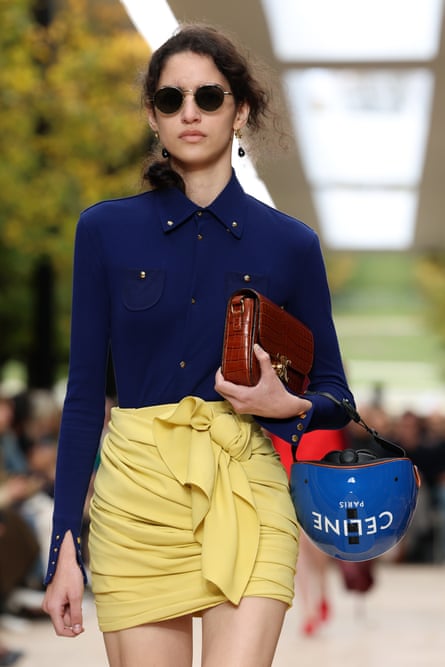
At the Celine show at Paris fashion week, there was a rugby shirt in blue and red with a white collar; also, a blue shirt tucked into a yellow miniskirt. At Alaïa – the home of chic, inky black – there was a red skirt-and-top two-piece and a yellow trench. At Prada, there were practical boxy jackets in cheerful yellow and green, the sort of coat shades that would look more at home hanging on animal-themed pegs outside a nursery classroom than on the Milan catwalk. At Loewe, moulded dresses came in pop art splashes of blue, yellow and red.
What works on the runway does not necessarily translate into the real world, but here are some tricks that do. Take another look at the red knit in the picture above. If all the other elements of the outfit were monochrome, the red would look harsher. Adding an in-between colour – in the form of the classic work-shirt blue of the sleeves – serves as a bridge, visually, between the dark trousers and the bright jumper. Denim is a great option. A bright coat or jacket, for instance, looks more suave if you wear it with jeans. Perelló-olive khakis are a good foil for a primary-toned knit top.
You might feel that you are on the safest ground wearing bright colours with black. This works best if the black pieces have an element of drama. A blue blouse with black trousers? Yes, but can the trousers be leather? High-waisted, perhaps, or extra wide? If you are wearing one attention-grabbing colour it is tempting to think the rest of your outfit should be bland but, in fact, a bright-meets-black outfit will have more balance if the black feels like a style choice in its own right.
If Lego colours feel a little too attention-grabbing, wearing them on the bottom half of your outfit turns the volume down. A bright skirt with a white shirt feels bold but not silly.
Texture helps to temper too. A blue in brushed mohair or a yellow in rich crepe will appear more grownup. Texture gives the colour somewhere to sit, rather than leaving it to shout into the void.
Scale matters too. Traffic-light colours look more deliberate in confident shapes. A neat little cardigan in scarlet can feel apologetic, whereas a generously cut sweater in the same reads as purposeful. Accessories are a useful entry point if you are not yet ready to commit. Even better if the accessory has a bit of personality of its own – think exaggerated proportions, interesting hardware.
Primary colours do not have to be worn solo. Red and blue feels classic, almost collegiate. Blue and yellow is fresh and surprisingly flattering. The key is to avoid introducing too many tones at once: two is confident, three is risky, four is a cry for help.
Model: Daria at Milk. Stylist’s assistant: Charlotte Gornall. Hair and makeup: Sophie Higginson using Bumble & Bumble and makeup by Mario. Earrings, £315, Thomas Sabo. Shirt, £77, & Other Stories. Red knit, £115, Jigsaw. Trousers, £59.99, Mango. Suede bag, £350, Gant