.png) 2 hours ago
6
2 hours ago
6
‘We need to rethink what a successful magazine looks like,” says Steve Watson, founder of the subscription magazine club Stack. “It doesn’t make sense to compare the magazines of today to those of the 1960s when many people still didn’t have colour televisions. Print magazines are no longer the best way of reaching lots of people quickly and cheaply but they are still really great at engaging deeply with readers, providing an opportunity to slow down and absorb information. They provide us with an alternative way of seeing the world.”
Watson, along with a group of editors, publishers, designers, historians and academics, will be discussing the varying roles and functions that magazines have played over the years during a one-day event at the forthcoming London design festival. In contrast to the doom and gloom we often hear about the print industry, he remains upbeat about the humble mag’s future. “The truth is there are brilliant new magazines launching all the time,” he says.
And with every new title comes new opportunities for bold, innovative and eye-popping cover design. Here, industry experts – including many taking part in the London design festival event – pick out their favourite magazine cover designs and tell us why they find them so enduring …

Blast, issue 1, 1914
Scott King, ex-art director for i-D magazine and former creative director for Sleazenation
Blast was published a month before Britain entered the first world war. It was an anti-petit-bourgeois rant against the professional classes. It features lines such as “Curse abysmal inexcusable middle class” and “The britannic aesthete – cream of the snobbish earth”. It was – for want of a less gratuitous expression, given when it was published – a call to arms. It was punk 60 years before punk was invented. In fact, Blast often reads exactly like a Fall song [the band’s singer Mark E Smith was a huge fan], with the artist and editor Wyndham Lewis piecing together phrases into a collage of barely focused loathing: “Blast the amateur, sciolast, art-pimp, journalist, self man, no-organ man.”
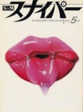
S&M Sniper, issue 5, 1984
Meara Sharma, senior editor of Elastic
This is a fetish magazine but it does what I think every magazine cover needs to do: seduce. It’s luring a reader in, tickling the senses, giving a flavour of what’s inside, but also tantalising whoever’s passing by. This does a great job of fulfilling that mandate of seduction. The art itself is this incredible photorealistic airbrushed painting by Yosuke Onishi, an amazing Japanese artist who featured in every issue. So the artist gets to play, but you get this lovely consistency and distinct look, and it becomes unmistakably that magazine. It’s so lush, visceral and delicious. The lips are dripping and they feel like they’re bursting out of the page.
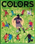
Colors, issue 90, 2014
Steve Watson, founder of Stack magazines
This is the last issue of Colors ever published and it was edited by Patrick Waterhouse, who I think is a genius. This was the year of the World Cup in Brazil, so they did a survival guide to football but they took a completely different view. There’s stuff in here about refugee and amputee teams and artists who change the shape of the football pitch to explore what it would do to the game. It’s full of of nice little symmetries and links: it’s issue 90 and a football match is 90 minutes long, and the cover has got this gold foil on it that references football cards. It’s loads of fun, but also really clever.
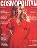
Cosmopolitan debut UK issue, 1972
Dr Sharon Maxwell Magnus, media historian and principal lecturer in mass communications at the University of Hertfordshire
Cosmopolitan was different from anything that went before it. Other women’s magazines in the UK, at the time, focused on domestic life, family, cooking, recipes, and were very homely. This was for women not bound by marriage and children, and who can, and are, having sex before or outside marriages. The cover is a brilliant partnership between design and words. It’s daring but not so daring that newsagents aren’t going to stock it. It was a revolutionary moment for the magazine industry and it sold 350,000 copies by lunchtime on its first day.

Life magazine: Faces of the American Dead in Vietnam, 1969
Jaap Biemans, art director at Volkskrant magazine
This cover is like a slap in the face. You have the image of a face, just like you see on thousands of covers, but when you read the headline you get goosebumps everywhere. It’s the maximum of emotion with minimal elements. It’s a great execution by cropping the face and, design-wise, it’s the most simple cover you can make but it’s got such an impact. When you look at normal covers about war, you see heroic poses, grieving people, flags, explosions, battlefields. But on this one, you don’t see any of that, but it fires into your mind and heart like an arrow.
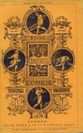
Cornhill, December 1865
Tony Quinn, magazine historian and founder of Magforum
The people behind this cover were all working at the top of their trade. It was edited by William Makepeace Thackeray and engraved by WJ Linton, while designer Godfrey Sykes was working at the time on the architectural decoration for the V&A Museum. Cornhill was named after a street that had a market where they brought in agricultural products, so Sykes interprets Cornhill via the manufacturing of corn: each roundel shows a stage of making it. Everything about this cover has a story behind it. It also changed the way that names were invented for magazines – within about 40 years there were dozens of magazines named after streets in London, from Pall Mall to the Strand.

Bloomberg Businessweek, 2 May, 2016
Alice Sherwin and Harry Bennett, founders of Studio Ground Floor
Designer Tracy Ma’s run for Bloomberg Businessweek was unbelievable – as her work continues to be. For us, this is a particular standout, because it both embodies her editorial approach to the periodical and taps into something we love in design: everyday visual language. Typographically, systematically and spatially, Tracy draws on familiar visual cues, the design that comes to exist without designer’s involvement, and subverts them. That way, people are drawn in and then shown something surprisingly new. In this case, it’s super self-aware. Kitsch and boring. It’s sublime design and a capsule for the time, helping its audience better understand the issue at hand through creative choices.
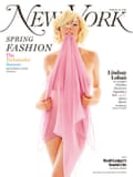
New York magazine, Lindsay Lohan as Marilyn Monroe, 2008
Charlie Baker, editor of the Fence
I was 19, living in New York, and remember being struck by this. I think this was the last era when you could do a cover that would be a little bit daring, bold, and put it out into the ecosystem as a way of getting readers to buy it. It was like a last great show of what covers can do. I think it’s good for tasteful erotic things to be in mainstream culture but I don’t think you could do something like that now.

Frieze, issue 134, 2010
Frith Kerr, art director at Studio Frith
I love this. It’s an instinctive, joyful response to something poetic made from the very ordinary: a sock, a foot and a logotype. The image is so concise that the magazine becomes an artwork – an egalitarian one that you can afford. Art should not only be for the super-rich. The scale is important, as is the sharp yellow of the logotype. The graphic simplicity poses a question. It is a visual idea. Questions are much more potent than answers as they engage and form relationships. Visual communication is all about creating relationships. A good magazine cover, like this, will instantly do that.

Interview magazine, Lana Del Rey, 2023
Jeremy Leslie, founder of magCulture
This cover really struck a chord. The photoshoot by Nadia Lee Cohen is timeless, this could have been the 1950s or 70s. It’s a fabulous portrait of a woman that was really of that moment. It sold out and became hugely in demand. I visit universities for talks and there’s a box of magazines I take with me and my copy of that went missing at one. It’s easy to go back and find classic covers from, say, the 1960s but that was a different time. It’s interesting seeing how today a cover can still punch above its weight and deliver something that’s an iconic cultural moment.